
SyntactxClinical Research Services
- Branding Strategy
- Technology Advisors
- Technology Development Team
- Creative Direction and Design
- UI / UX
Overview
|sin-'tak-tiks| = “bring together with structure.”
Syntactx delivers the highest quality clinical research services based on a well-defined strategy, collaboration, and transparency, thereby reducing time to execution and minimizing the overall risk of a project. Clients benefit from their agility, decades of experience, on-staff physicians, and excellent relationships.
Ranked #241 on the 2015 Inc. 500 list of the fastest-growing private companies in America, Syntactx is headquartered in NYC. Operating in a competitive vertical, Syntactx sought to separate themselves by rebranding the company and launching a new site that offers users a healthy lifestyle image that leaves their corporate, medicinal, out-dated, and sterile visuals behind.
Branding
Syntactx targets top-level executives and medical professionals who are decision makers looking for highest quality clinical research services.
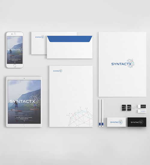
The creative process for re-branding Syntactx included producing a new logo. The early logo comps played with the ’S’ in Syntactx, with shapes reflecting their extensive experience and commitment to excellence. We experimented with hexagonal symbols representing teamwork and efficiency. That hexagonal symbol morphed into a network of lines that symbolize the neurons within the brain, as well as branches of a tree.
The neurons represented innovation and the tree branches represented knowledge and experience, all tremendous qualities strengths of Syntactx. That symbol was then converted to three different versions; Organic, Geometric, Dimensional. The dimensional logo treatment emerged as the clear winner because of its clean lines and modern aesthetic. When combined with the custom font, the logo symbolizes innovation, experience, network, and growth.
The cerulean blue was enhanced by bright green and red, contributing to the trustworthy quality of the brand and separating it from otherwise mundane medical logos and websites.
Complementary fonts were chosen to maintain a consistent look and feel across all brand verticals and deliverables.
Wireframes
Responsive Website
Key Features
- Home page video created with Rotoscoping in Adobe After Effects to create a 3-dimensional experience
- Overall design is a combination of healthy lifestyle images mixed with corporate details of the business to provide a positive feeling while browsing the site
- Owncloud - file sharing system side-by-side with site
- Responsive web enabled
- Progressively enhanced site built for maximum cross-browser compatibility to accomodate the diverse technologies used by Syntactx clients
- Fully device agnostic (desktop, tablet, mobile)
Desktop
More Examples
Case study
Syntactx | Digital Product Case Study | Genome Studio: strategy, craft, and momentum
Syntactx | Digital Product Case Study | Genome Studio: strategy, craft, and momentum began as a question about specialist healthcare communication. The people involved needed an experience that could explain the value quickly while still leaving room for the detail behind it. We started by looking at the moments when people seeking confidence in a complex service need to decide, compare, remember, or act, then used those moments to establish a clearer order for the story.
The central design challenge was making expertise feel understandable without flattening the detail that matters. Content, layout, and interaction were considered together so that the page could carry atmosphere without hiding the information that gives the project its purpose. Early prototypes helped the team test tone and rhythm before visual polish made any single direction feel inevitable.
The finished specialist healthcare communication experience is shaped by real conditions. People may arrive from a small screen, enter at a deep link, skim between sections, or return later looking for one specific answer. Headings, labels, imagery, and responsive behavior therefore work as a connected set of signposts. Each detail has a job in helping people seeking confidence in a complex service feel oriented.
Implementation for specialist healthcare communication carried the same care into the working system. Reusable patterns make future updates easier, while thoughtful loading behavior protects the first impression. The structure can support new stories, products, or campaign moments without asking the team to rebuild the entire experience whenever the content changes.
The lasting value of Syntactx | Digital Product Case Study | Genome Studio: strategy, craft, and momentum is the shared understanding it creates. Stakeholders can see how the experience supports a wider goal, content owners have a clearer way to work, and technical teams inherit decisions that communicate intent. That alignment gives this project a better chance of staying useful long after its launch moment.
Compare this specialist healthcare communication case study with other digital work, explore the supporting services, or read the studio journal for practical thinking about products and experiences. To discuss a similar challenge, visit contact.