
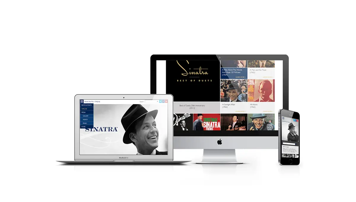
Frank Sinatra The Official Site
- SITE ASSESSMENT
- DESIGN
- BUILD
- Metrics Analysis
- Content Structure
- Wireframes
Overview
Commissioned by Universal Music Enterprises to re-imagine, re-design, and re-build a new responsive web experience for Frank Sinatra. Focusing on marrying an iconic artist / iconic brand with a cutting edge technical implementation allowing users to experience the site on any device, enabling ease of access and increased engagement.
As we re-imagine the vision of FrankSinatra.com our goal was to highlight and celebrate an icon’s artistic life. By capturing his essence through imagery as the primary vehicle, we intend to immerse the user in a rich experience.
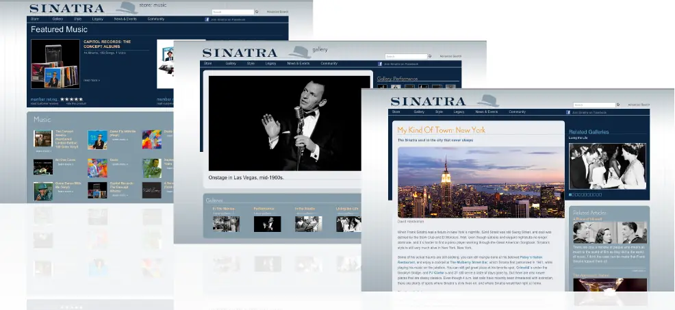
Where they were
- Copy-heavy and content rich with complex navigation lacking visual assets for UI/UX.
Content Structure
The old site had too many sub pages and multiple pages that stood alone and didn't fit anywhere.
We recommended removing irrelevant information, reducing copy substantially and thus having only 5 primary pages with 8 secondary pages.
This made the experience easier to navigate and helped visitors find the right story sooner.
Wireframes
Developed keeping in mind the ease required to access information by fans of all ages and a modular structure to facilitate use across desktop and mobile.
Creating a timeline helped consolidate a lot of content into one bucket.
Website
More Examples

Case study
Re-imagining FrankSinatra.com around imagery and story
Universal Music Enterprises asked Genome to re-imagine, re-design, and re-build FrankSinatra.com as a responsive experience. The engagement covered the whole arc of the work: a site assessment and metrics analysis, a new content structure and wireframes, then design and build. The aim was to highlight and celebrate an icon's artistic life on any device a visitor might use.
The assessment surfaced the central problem. The existing site was copy-heavy and content-rich, with complex navigation and few visual assets to support the UI and UX. For an artist whose presence is so visual, a text-led structure made it hard to feel who Sinatra was, and hard for visitors to find their way through everything the site holds.
The response was to make imagery the primary vehicle for the story. Leading with photography gives visitors an immediate emotional way in, and the copy can sit behind it as depth for people who want to read further. Reworking the content structure and wireframes before visual design meant navigation could be simplified with the metrics analysis in hand, rather than following how the old site happened to be organized.
Responsiveness was treated as a requirement from the start, not a later adjustment. An official artist site with a long archive is visited from desktops, tablets, and phones, and the brief explicitly asked for ease of access on any device. Designing the image-led layouts to hold up at every size keeps the experience consistent wherever someone arrives.
The rebuilt structure gives Universal Music Enterprises a site that pairs an iconic brand with a current technical foundation. With content organized deliberately and visuals doing the introductory work, the team has a clearer framework for adding material over time without returning to the cluttered navigation the project began with.
Compare this artist archive design case study with other digital work, explore the supporting services, or read the studio journal for practical thinking about products and experiences. To discuss a similar challenge, visit contact.