Studio journal ·
Designing Digital Products for Real-World Use
A practical perspective on product design and discovery from the Genome Studio team.
Digital products rarely fail because a team cannot draw a beautiful screen. They struggle when the experience does not reflect the messy conditions in which people actually make decisions. A customer may be distracted, using a small device, returning after several weeks, or arriving with language that does not match the organization’s internal vocabulary. Designing for real-world use means treating those conditions as the brief, not as exceptions to solve at the end.
The first useful step is to describe the job people are trying to complete. A job is more specific than a demographic and more durable than a campaign message. Someone may need to compare options, ask for help, confirm a detail, or feel confident enough to begin. Mapping those moments gives the team a shared lens for prioritizing content, navigation, and interaction. It also exposes where a product is asking users to understand the organization before it has earned their attention.
Good discovery combines evidence with imagination. Analytics can show where people leave, interviews can explain what they expected, and support conversations can reveal the words they use when something is unclear. A prototype then turns those observations into something concrete enough to discuss. The goal is not to predict every behavior; it is to create a short learning loop in which assumptions become visible while change is still affordable.
Accessibility improves the quality of this work for everyone. A clear heading structure helps a screen-reader user navigate, but it also helps a hurried visitor scan. A visible focus state supports keyboard users, but it also makes a complex interface easier to understand. Sufficient contrast, readable type, descriptive labels, and restrained motion reduce cognitive effort. When these decisions happen early, they become part of the product’s character rather than a patch added after launch.
Content deserves the same care as the interface around it. Short labels should describe the action, not the internal team that owns it. Empty states should explain what happened and what to do next. Error messages should give people a path forward without blaming them. Editorial examples, tooltips, and supporting explanations should be written with the same audience model used for the primary journey.
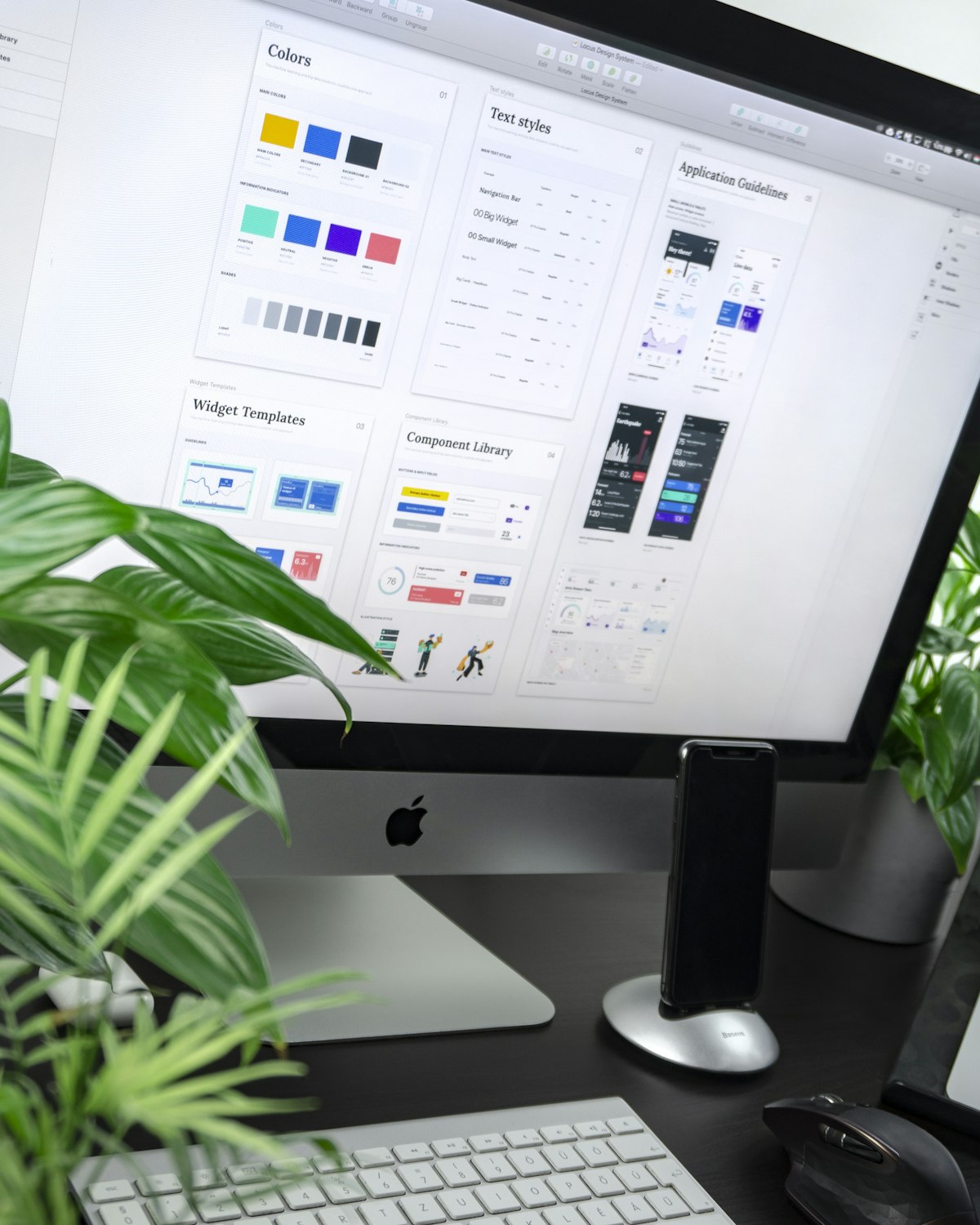
A small system of reusable patterns helps a product stay coherent as it grows. Components should describe a shared behavior while leaving room for context, rather than forcing every page into an identical template. Documenting decisions, content rules, and accessibility expectations creates a bridge between design and engineering. It also gives future contributors a way to extend the product without quietly undoing the choices that made it useful.
Measurement should focus on outcomes rather than decoration. A successful product might reduce support requests, increase completed applications, shorten the time needed to find information, or help a team publish more confidently. Qualitative feedback gives those numbers meaning. Reviewing both together keeps optimization connected to human value and helps the team avoid making a screen more clickable while making the overall journey more confusing.
Real-world design is therefore a practice of respect. It acknowledges that people bring limited time, different abilities, uncertain context, and strong expectations to every interaction. The most memorable experiences are often the ones that remove unnecessary effort while still offering a distinctive point of view. When strategy, content, design, and engineering share that goal, the product becomes easier to trust and easier to improve.
Three useful checks
- Can a first-time visitor understand the next step without insider language?
- Does the experience remain clear, fast, and accessible on a small screen?
- Can the team maintain and improve the content after launch?
A simple working example
| Question | Useful signal | Next action |
|---|---|---|
| Where do people hesitate? | Searches, exits, support themes | Clarify content and hierarchy |
| What slows progress? | Load, interaction, form data | Remove friction and retest |
| What should improve next? | Outcome and feedback trends | Prioritize a focused iteration |
For a related perspective, explore our design services, browse selected product work, or return to the blog index.
Make the next question easier to answer
Design is most useful when it anticipates the conditions around a decision. Look for the moment a visitor arrives with limited time, partial context, or a question that the interface has not answered yet. A short explanation, a clear comparison, or a well-placed related link can reduce hesitation without adding visual weight. Teams can find these moments through observation, support conversations, and small content walkthroughs before committing to a larger redesign.